Flare vs Sunburst in brief: OpenAI describes Flare as its fastest GPT Image 2.5 model for high-quality everyday generation, and Sunburst as its most capable model for generation and precision editing. Both handle text-to-image and reference editing, and both carry the same API token rates. OpenAI introduced them together as part of ChatGPT Images 2.5.
We tested both with repeated 2K / High renders, a close inspection at 100% zoom, six three-round editing chains, and a typography test. Flare was faster at generating new images. Sunburst was faster at reference edits in five of six matched rounds and produced the strongest textile and glass samples, though not consistently. Neither model preserved details better across repeated edits.
Our recommendation: use Flare for most text-to-image iteration, and test Sunburst when reference-edit speed or fine textile detail matters.
Flare | Sunburst | |
|---|---|---|
Text-to-image speed | Faster in every matched run | 52–81% longer |
Reference-edit speed (6 matched rounds, 12 runs) | 35.7 s average | 27.6 s average; faster in 5 of 6 rounds |
Material detail | Competitive; best ceramic sample | Strongest textile and glass samples |
Named details across three edits | Preserved in every chain | Preserved in every chain |
Gold-rim sampling (Sequence A) | No progressive change detected; within 2 px of the base | No progressive change detected; within 2 px of the base |
Price | Same as Sunburst except at 2K / Low and 2K / Medium | Higher at 2K / Low and 2K / Medium only |
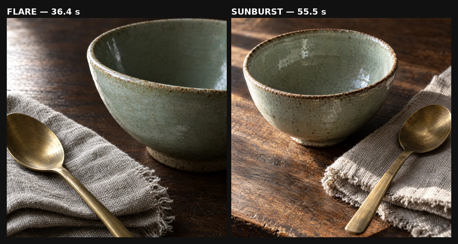
The same 2K / High prompt, first output from each model. Flare left (36.4 s), Sunburst right (55.5 s).
Test setup. Every comparison used the same prompt and settings for both models. We kept the first output every time, with no rerolls or retouching. Runs were timed in the browser from submission until the finished image was ready. In the editing chains, each round used the previous round’s own output as its only reference. Every prompt is reproduced in full below.
Test 1: the same material brief, three runs per model
Before comparing models, we wanted to see how much each model varies from itself. The brief ran three times with Flare and three times with Sunburst at 2K / High, 1:1, PNG, on September 20.
The prompt combines four materials that fail in different ways: irregular ceramic glaze, directional brushing on steel, visible linen fibers, and faceted glass with water refraction, plus exact lettering and a thin gold rim.
Create a premium studio still life designed to test material rendering. Arrange exactly four objects on a neutral warm-gray surface: a cobalt-blue glazed ceramic jar with a thin gold rim and the small white word “NORTH” centered on its front; a brushed stainless-steel spoon leaning against the jar; a folded natural beige linen napkin with clearly visible woven fibers; and a clear faceted glass tumbler half-filled with water. Use a dark charcoal background, controlled side lighting from the upper left, and realistic contact shadows. Preserve distinct material behavior: irregular ceramic glaze, fine directional metal brushing, individual linen threads, crisp glass edges, water refraction, and accurate gold reflections. Square composition, close product-photography framing, no other objects, no extra text, no watermark.
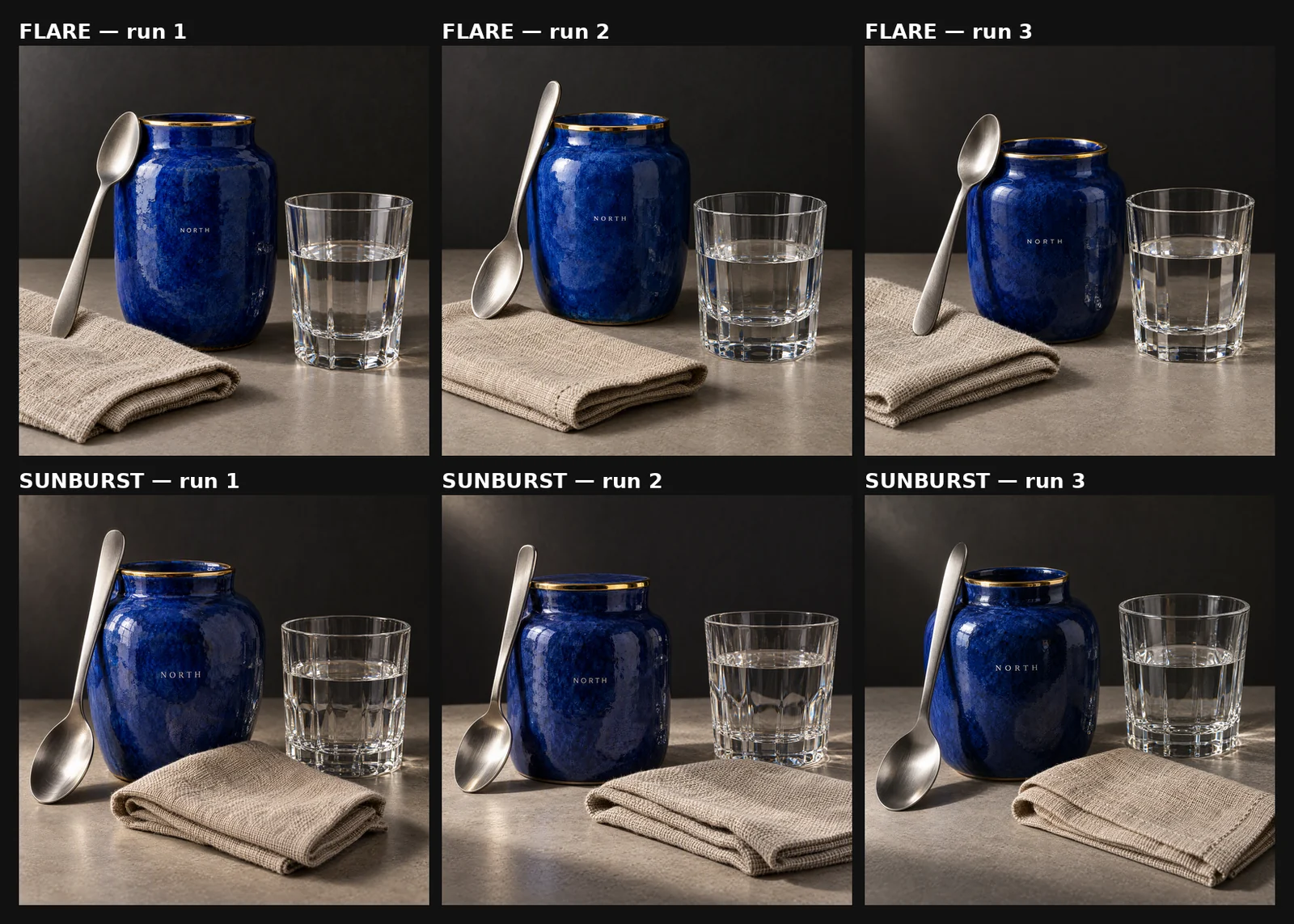
Top row: Flare, runs 1–3. Bottom row: Sunburst, runs 1–3. All first outputs.
All six outputs passed the countable checks: one jar, one spoon, one folded napkin, one half-filled glass, “NORTH” spelled correctly, and a visible gold rim.
The material differences did not line up neatly by model:
Ceramic: Flare run 1 showed the most pronounced irregular glaze. Sunburst’s jars tended to look smoother and heavier.
Metal: both rendered directional brushing. Flare run 3 had the cleanest satin finish.
Linen: Sunburst run 3 showed the clearest fibers and fold structure. Flare showed woven texture in all three runs.
Glass: Sunburst runs 2 and 3 had the strongest faceting and internal reflection.
In our visual review, variation between repeated outputs sometimes appeared larger than the difference between models. That is a qualitative observation, not a statistical result, but it has a practical consequence: a one-image comparison can easily mistake run-to-run variation for a model-level difference.
Test 2: a closer look at 100% zoom
Repeated runs show variance. They do not show whether either model resolves finer detail up close. For that, a second material brief ran once per model at 2K / High on September 20, and we inspected both outputs at 100%. The full frames are shown at the top of this article.
A photorealistic close-up still life on a dark walnut table: a hand-thrown stoneware bowl with a pale celadon glaze showing fine crackle crazing, a folded raw linen napkin with a visibly woven texture and one frayed edge, and a brushed brass spoon resting on the napkin. Hard side light from the left rakes across every surface. Render the fine crazing lines in the glaze, individual linen threads, and the circular brushing marks on the brass. Shallow depth of field focused on the bowl rim. Square composition, no text, no watermark.
Glaze: comparable. Both produced a complete crackle network across the bowl wall. Flare’s craze lines are slightly finer. Sunburst’s carry more staining and iron speckling, which looks like a difference in interpretation rather than resolution.
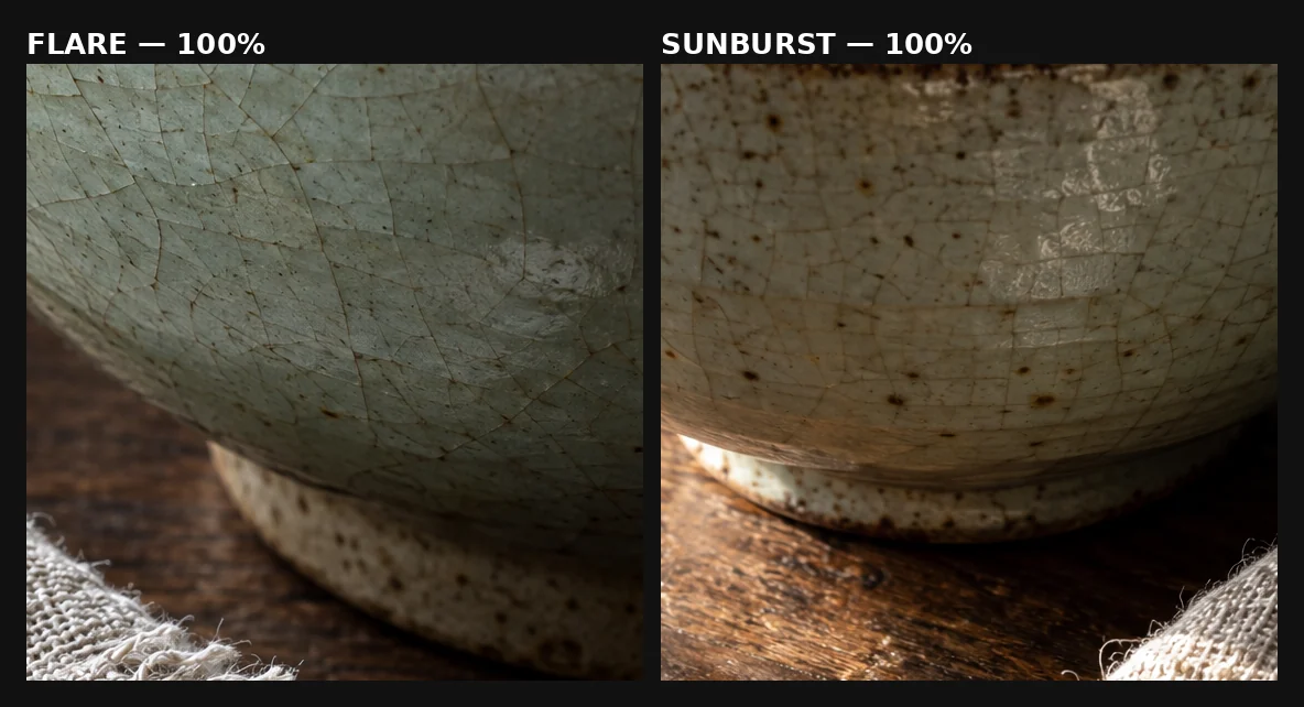
Glaze at 100%. Flare left, Sunburst right.
Linen: Sunburst showed more visible yarn structure in this output, with plied threads and separated strands along the frayed edge. However, its closer framing gave the fabric more pixels and may explain part of the difference. This Sunburst output took longer and also showed more resolved yarn structure, but this test cannot establish that the additional latency caused the difference.
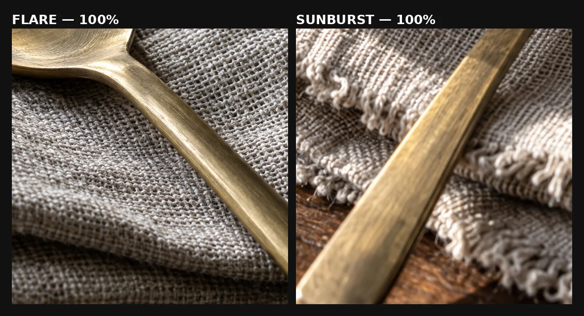
Linen at 100%. Flare left, Sunburst right. Note the different framing distance.
Taken with Test 1, Sunburst produced the strongest textile sample in both material tests. Neither test controlled framing tightly enough to treat that as a stable model difference.
Test 3: three rounds of editing
OpenAI positions Sunburst for precision editing, so we tested repeated edits rather than a single change. Every round used the previous round’s own output as its reference, which lets small changes accumulate.
We ran two editing sequences. Sequence A ran twice per model, with the model order reversed on the second run. Sequence B ran once per model. That makes six model-specific three-round chains.
Both sequences started from a Flare output of the same base prompt:
Create a photorealistic studio product photograph of one cobalt-blue ceramic mug on a warm ivory tabletop. The mug has one C-shaped handle on the right, a thin gold rim, and the exact word “NORTH” printed in small white uppercase letters centered on its front. Place exactly three coffee beans on the tabletop to the left of the mug. Soft daylight comes from the upper left, casting a gentle shadow to the lower right. Show subtle ceramic glaze texture and realistic gold reflections. Eye-level three-quarter view, uncluttered ivory background, square composition. No other objects, no extra text, no watermark.
Sequence A: recolor, add a napkin, change the background
All four Sequence A chains started from the same base image, generated once at 1K / Medium.
The shared starting point, shown at the left of each row below: cobalt glaze, thin gold rim, “NORTH” in white capitals, handle on the right, and exactly three coffee beans.
In short: round 1 recolors the glaze to emerald green, round 2 adds a folded linen napkin beneath the beans, and round 3 changes the background to warm mid-gray.
View all three Sequence A prompts
Round 1
Change only the cobalt-blue ceramic glaze of the mug, including the handle and the visible interior, to a deep emerald green. Keep the thin gold rim, the small white “NORTH” lettering, exactly three coffee beans and their positions, the ivory background, the lighting, the shadow, the camera angle, and the crop exactly as they are. Do not add or remove any object or text.
Round 2
Place a folded ivory linen napkin flat on the tabletop beneath the three coffee beans. Change nothing else: keep the mug’s shape, size and position, its green glaze, the thin gold rim, the small white “NORTH” lettering, exactly three coffee beans, the background, the lighting, the shadow, the camera angle, and the crop exactly as they are. Do not add or remove any other object or text.
Round 3
Change the background and the tabletop from ivory to a warm mid-gray. Keep the mug, its green glaze, the thin gold rim, the small white “NORTH” lettering, exactly three coffee beans, the linen napkin, the lighting direction, the camera angle, and the crop exactly as they are. Do not add or remove any object or text.
The first run spelled “mid-grey”; the prompts were otherwise identical in both runs.
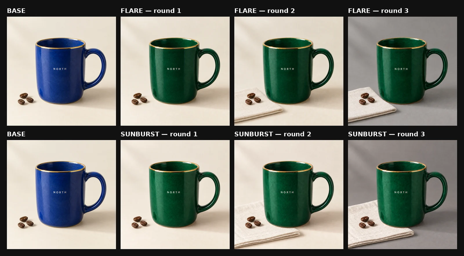
First run (September 20, Flare first). Each row: base image, then rounds 1–3.
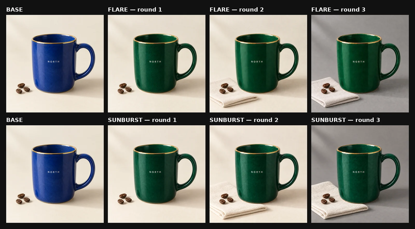
Second run (September 21, Sunburst first). Same base image and prompts.
What held. In all four chains, “NORTH” stayed correctly spelled, in the same letterforms and position, through round 3. Every output kept exactly three beans in the original arrangement, and the handle stayed on the right.
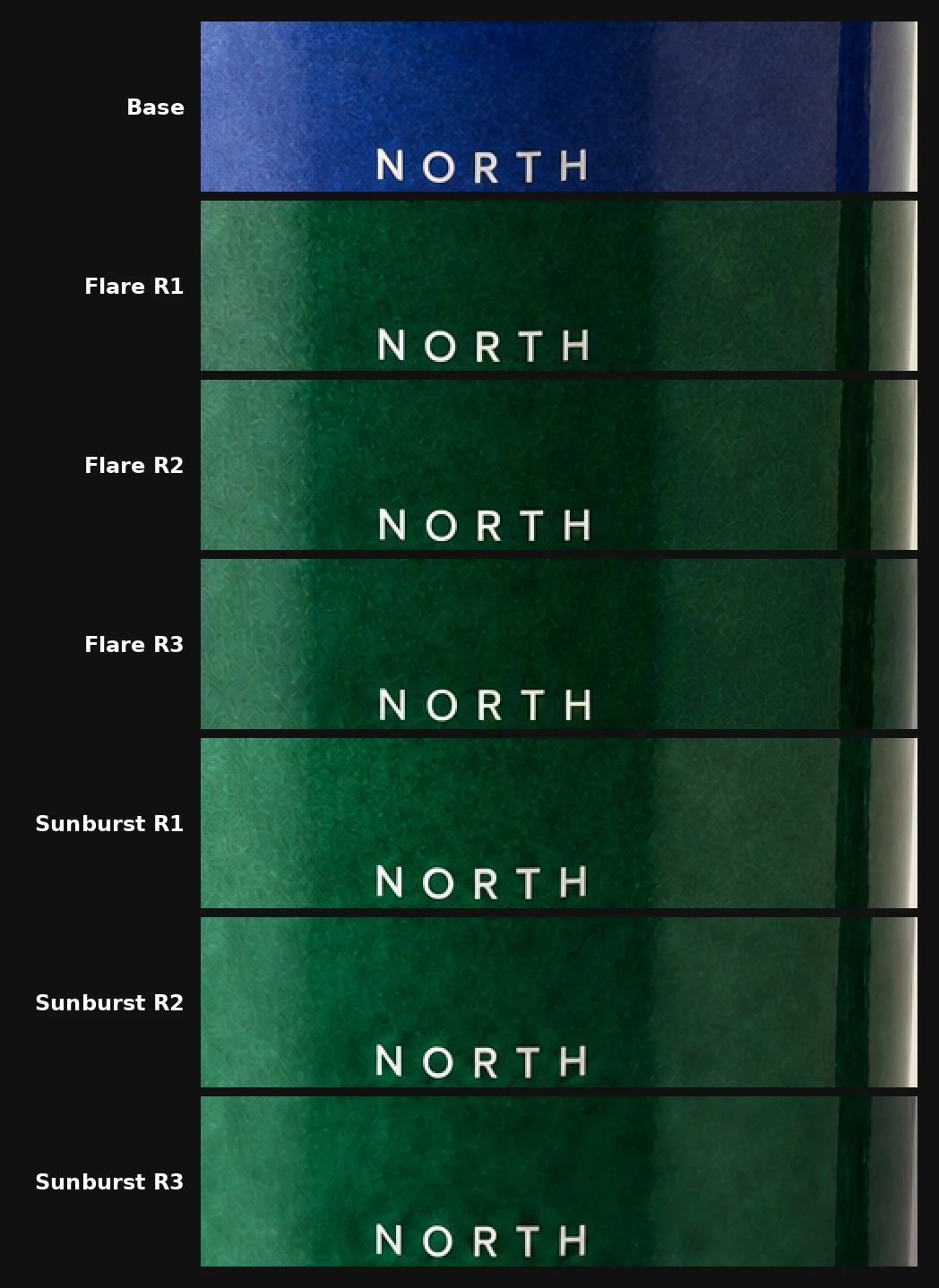
Lettering enlarged 2×, base through round 3, first run.
What we measured. Visual side-by-sides can mislead: a gold rim against dark green reads heavier than the same rim against blue. So instead of judging the rim by eye, we sampled it along five evenly spaced vertical lines across the mug’s width, at the same pixel coordinates in every image. We did not align the images first; because the mug barely moved, the same lines crossed the rim in every image. Gold pixels were identified with the same color threshold throughout.
Across all twelve edited images, the detected gold boundary varied by no more than two pixels from the base image. Using this sampling method, we found no directional thickening or progressive shift across the three rounds, for either model. Differences of one to two pixels can include antialiasing and very slight whole-image offsets: in one image, all five lines sat exactly two pixels higher, which is a small shift of the entire frame rather than a change to the rim.
Pixel measurements were taken from the original 1024 × 1024 PNG files before cropping or WebP conversion. The WebP comparisons shown on this page are for visual reference.
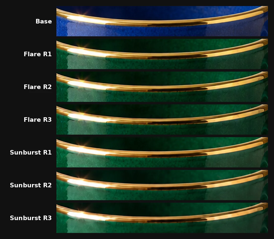
The rim enlarged 2×, base through round 3, first run. Pixel sampling across both runs found no progressive change in rim thickness or position.
Raw rim measurements after round 3
Thickness of the front rim, in pixels, at each sample line (x-coordinate in a 1024 × 1024 image).
Sample line | Base | Flare R3, run 1 | Flare R3, run 2 | Sunburst R3, run 1 | Sunburst R3, run 2 |
|---|---|---|---|---|---|
x = 330 | 5 | 5 | 5 | 5 | 6 |
x = 420 | 12 | 12 | 12 | 13 | 13 |
x = 510 | 6 | 6 | 6 | 6 | 6 |
x = 600 | 12 | 14 | 14 | 13 | 14 |
x = 690 | 8 | 8 | 8 | 8 | 8 |
Vertical offset of the rim’s top edge from the base image, in pixels (negative is higher):
Flare R3, run 1 | Flare R3, run 2 | Sunburst R3, run 1 | Sunburst R3, run 2 | |
|---|---|---|---|---|
Range across five lines | −1 to 0 | −1 to 0 | −1 | −2 (all five lines) |
A pixel counted as gold when red ≥ green > blue, red − blue > 45, red > 100, and red + green + blue > 220. The wider values at x = 420 and x = 600 fall where the rim curves and catches a highlight. Rounds 1 and 2 were measured the same way and fell within the same range.
What changed without being asked. Both models made the napkin considerably larger than “beneath the three coffee beans” implies, in both runs, so that it filled much of the lower frame. That is a composition choice rather than a preservation failure, but it is a reminder that “change nothing else” does not constrain the size of the object you are adding.
Sequence B: recolor, add a tray, change the lighting
The second sequence started from a separate Flare output of the same base prompt. It recolored the mug, added a walnut serving tray, and then replaced the lighting with a hard key from the right.
View all three Sequence B prompts
Round 1
Change only the cobalt-blue ceramic glaze of the mug, including the handle and visible interior, to a deep emerald green. Preserve the mug shape, size, position, handle geometry, thin gold rim, small white “NORTH” lettering, exactly three coffee beans and their positions, ivory background, lighting, shadows, camera angle, and crop. Make no other changes.
Round 2
Add a rectangular walnut serving tray beneath the mug and the three coffee beans. Preserve the emerald-green mug exactly: keep the same shape, handle, thin gold rim, white “NORTH” lettering, glaze texture, size, position, and camera angle. Keep exactly three coffee beans in their existing arrangement. Preserve the ivory background, lighting, shadows, and square crop. Do not change anything except adding the tray.
Round 3
Change only the lighting to a hard directional studio light from the right, creating a crisp shadow toward the lower left. Preserve everything else exactly: the emerald-green mug, its shape and handle, thin gold rim, white “NORTH” lettering, glaze texture, walnut tray, exactly three coffee beans and their positions, ivory background, camera angle, object scale, and square crop. Do not add, remove, move, or redesign any object.
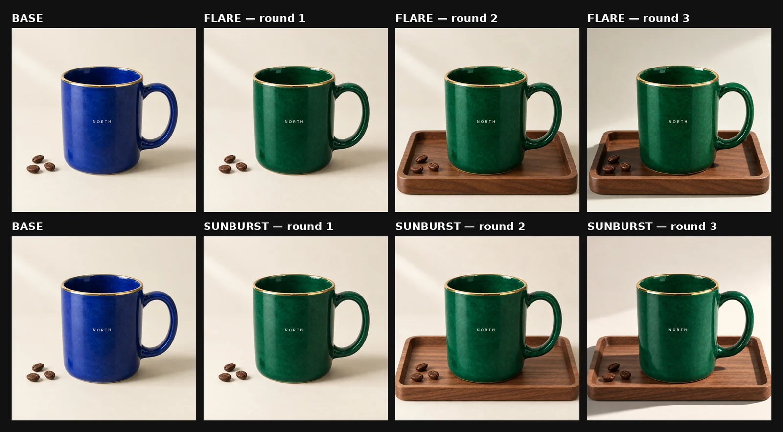
Sequence B. Each row: base image, then rounds 1–3.
Both models completed all three edits and kept “NORTH”, the three beans, the mug silhouette, and the gold rim through round 3. Both reframed slightly when the tray appeared, despite explicit preservation language, and then stayed stable through the lighting change. Sequence B was checked visually; we did not take pixel measurements.
What the editing tests show
Neither model showed a preservation advantage. Across six chains, both kept every named detail, and in Sequence A our pixel-sampling method detected no progressive change in the gold rim for either model. The differences we saw came from the added objects: both models took liberties with the size of a new napkin, and both reframed to fit a new tray.
For multi-round work, that points to the prompt rather than the model. Name each detail that must survive in every round, and give a size or position for anything you add.
Test 4: rerunning the poster test
With a natural-sounding brief asking for four lines of text, both models wrapped the long headline “SLOW COFFEE CLUB” across three lines, producing six visible lines instead of four.
View the original poster prompt
Design a square editorial poster for a fictional coffee event. Warm cream background, dark navy typography, one flat orange circle in the upper right, and a small line drawing of a coffee cup at the bottom. Use a clear Swiss-inspired grid, generous margins, and no photographs. Render exactly these four lines of text, with no other words: “SLOW COFFEE CLUB” as the large headline at the top; “SATURDAY, OCTOBER 10” below it; “10 AM - 4 PM” as a smaller line; and “18 RIVER STREET” at the bottom. All four lines must be spelled exactly, fully visible, and readable. Keep the orange circle separate from the text. No watermark.
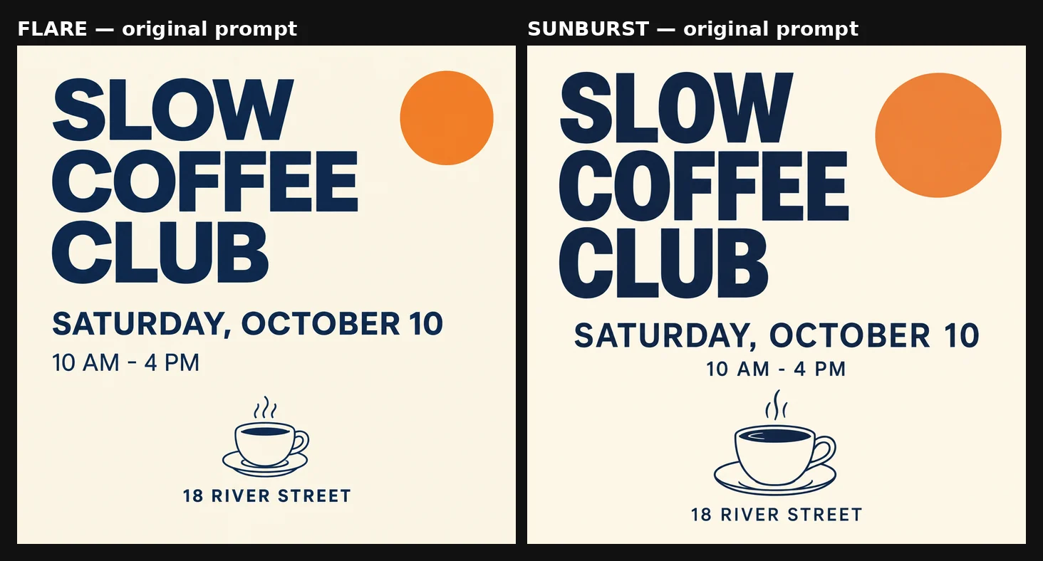
The original prompt. Both models spelled everything correctly but broke the headline across three lines.
We then rewrote the brief twice, both times at 1K / Medium.
First rewrite (September 20): add a single-line rule and remove the size cues. It lists the lines by number, drops the original “large headline” and “smaller line” wording, and tells the model to shrink the headline as needed to fit.
View the full first rewrite
Design a square editorial poster for a fictional coffee event. Warm cream background, dark navy typography, one flat orange circle in the upper right, and a small line drawing of a coffee cup at the bottom. Use a clear Swiss-inspired grid, generous margins, and no photographs. Render exactly these four lines of text and no other words: line 1 “SLOW COFFEE CLUB”; line 2 “SATURDAY, OCTOBER 10”; line 3 “10 AM - 4 PM”; line 4 “18 RIVER STREET”. Each line must sit on its own single unbroken line: do not wrap or stack any line across two or more lines. Reduce the headline font size as much as needed so that “SLOW COFFEE CLUB” fits on one line inside the margins. All text must be spelled exactly and fully visible. Keep the orange circle separate from the text. No watermark.
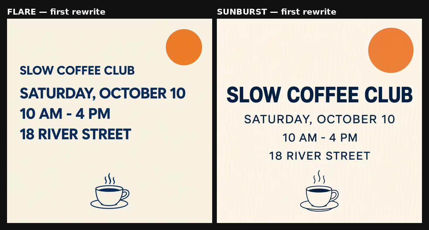
Flare left (24.8 s), Sunburst right (41.8 s).
Both models produced four unbroken, correctly spelled lines. Flare set the headline smaller than the date line, which complies with a prompt that asked for it to shrink and no longer asked for it to be large. Sunburst chose a centered layout with the headline as the largest text.
Second rewrite (September 21): state both requirements. Identical to the first rewrite except for one sentence: the shrink instruction is replaced by one that asks for hierarchy and fit together.
View the full second rewrite
Design a square editorial poster for a fictional coffee event. Warm cream background, dark navy typography, one flat orange circle in the upper right, and a small line drawing of a coffee cup at the bottom. Use a clear Swiss-inspired grid, generous margins, and no photographs. Render exactly these four lines of text and no other words: line 1 “SLOW COFFEE CLUB”; line 2 “SATURDAY, OCTOBER 10”; line 3 “10 AM - 4 PM”; line 4 “18 RIVER STREET”. Each line must sit on its own single unbroken line: do not wrap or stack any line across two or more lines. “SLOW COFFEE CLUB” must be the largest text on the poster, sized so that it still fits on one line inside the margins; the other three lines are clearly smaller. All text must be spelled exactly and fully visible. Keep the orange circle separate from the text. No watermark.
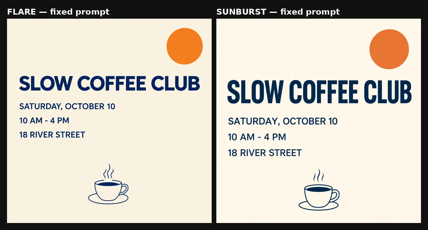
Flare left (18.9 s), Sunburst right (29.1 s).
Both models produced four unbroken lines with “SLOW COFFEE CLUB” as the largest text, spelled exactly, with the orange circle kept clear of the type. The original failure is better explained by an unresolved conflict in the brief than by a model limit. Once the brief said both what to fit and what to emphasize, both models delivered.
Speed: generation and editing showed different patterns
Across the tests above, we recorded how long every run took.
Text to image
Run | Flare | Sunburst |
|---|---|---|
Test 1 material brief, 2K / High, 3 runs each, median (Sept 20) | about 59 s | 107 s |
Test 2 still life, 2K / High (Sept 20) | 36.4 s | 55.5 s |
Test 4 first rewrite, 1K / Medium (Sept 20) | 24.8 s | 41.8 s |
Test 4 second rewrite, 1K / Medium (Sept 21) | 18.9 s | 29.1 s |
Flare was faster in every matched text-to-image run. Sunburst took 52% to 81% longer.
Reference editing — six matched rounds, 12 model runs. Sequence A from Test 3, run twice with the model order reversed.
Model | Run 1 mean (Sept 20, Flare first) | Run 2 mean (Sept 21, Sunburst first) | Combined |
|---|---|---|---|
Flare | 36.5 s | 34.9 s | 35.7 s |
Sunburst | 25.0 s | 30.3 s | 27.6 s |
Per-round editing times
Run 1 (Sept 20, Flare first)
Round | Flare | Sunburst |
|---|---|---|
1 | 33.5 s | 29.5 s |
2 | 43.5 s | 21.5 s |
3 | 32.5 s | 24.0 s |
Run 2 (Sept 21, Sunburst first)
Round | Flare | Sunburst |
|---|---|---|
1 | 42.9 s | 34.2 s |
2 | 27.6 s | 27.5 s |
3 | 34.2 s | 29.1 s |
Across six matched editing rounds — 12 individual model runs — Sunburst was faster in five and effectively tied in one. We treated differences below one second as ties. Reversing the run order did not reverse the result, but the gap was smaller in the second run (13% versus 31%).
Treat both patterns as observations from these sessions rather than guarantees. Absolute latency varied widely between sessions (Flare’s 2K / High render took about 59 seconds in one and 36 in another), rounds within a chain are sequential rather than independent, and platform queueing affects every number here.
How Flare and Sunburst pricing actually differs
XMK credits per image, shown as Flare / Sunburst, for generation and editing alike:
Quality | 1K | 2K | 4K |
|---|---|---|---|
Low | 10 / 10 | 10 / 20 | 20 / 20 |
Medium | 10 / 10 | 20 / 30 | 30 / 30 |
High | 30 / 30 | 40 / 40 | 70 / 70 |
Extra high | 50 / 50 | 70 / 70 | 120 / 120 |
Max | 90 / 90 | 150 / 150 | 250 / 250 |
As published on September 20, 2026. View the current credit table.
Sunburst costs more than Flare at two settings only: 2K / Low and 2K / Medium. At every 1K and 4K setting, and at 2K / High and above, the two cost the same.
At the API level, OpenAI publishes identical token rates for both models: $5 per million text-input tokens, $8 per million image-input tokens, and $30 per million image-output tokens. OpenAI does not assign Sunburst a higher token rate, although different token consumption can still produce a different total cost per image.
If you want 2K output from Sunburst, compare Medium with High before settling. 2K / Medium costs 30 credits and 2K / High costs 40, where the price matches Flare.
Which model should you choose?
Our overall recommendation: use Flare for most text-to-image iteration, and test Sunburst when reference-edit speed or fine textile detail matters. Neither model showed better multi-round preservation in our tests.
Everyday generation and quick drafts: Flare. It was faster at text-to-image in every matched run and costs the same at most settings.
Final images with fine textiles, glass, or similar materials: run both once and inspect the Sunburst version closely. It produced the strongest textile sample in both material tests and the strongest glass in the one test that included glass, but not in every run.
Reference-image editing: Sunburst is worth testing first if latency matters. It was faster in five of six matched editing rounds across two runs, and it preserved details just as well as Flare.
Multi-round editing: either model. Repeat every detail that must survive in each round’s prompt, and specify size and position for anything you add.
Strict layouts: state both the fit and the hierarchy you want, for example “one line, and the largest text on the poster”.
Comparing the models yourself: for an informal model comparison, start with at least three outputs per model. For an ordinary production task, compare only as many outputs as your budget and quality requirements justify.
New to the generator? The step-by-step guide on the GPT Image 2.5 page covers uploads, settings, and downloads, and the example gallery has prompts to start from. If you are coming from the previous generation, our GPT Image 2 review covers what GPT Image 2 could already do.
To reproduce these tests, open GPT Image 2.5 on XMK, match the settings listed with each test, and run the prompts above.
Method and limits
Test 1 | Test 2 | Test 3 | Test 4 | |
|---|---|---|---|---|
Mode | Text to image | Text to image | Reference edit | Text to image |
Settings | 2K / High | 2K / High | 1K / Medium | 1K / Medium |
Runs | 3 per model | 1 per model | 2 Sequence A chains + 1 Sequence B chain per model | 1 per model per prompt |
Date | Sept 20 | Sept 20 | Sept 20–21 | Sept 20–21 |
All tests used a 1:1 aspect ratio and PNG output. Every underlying model generation was a first output, downloaded without rerolling or retouching. The comparison grids and 100% crops were assembled from those original files; only cropping, layout, labels, and web compression were applied. No masks were used in the editing chains. Credit figures are XMK’s published rates.
Test 1 used three runs per model, enough to show observable run-to-run variation but not enough for a statistical benchmark, and its material comparisons come from an unblinded visual review. Tests 2 and 4 used one output per model per prompt. Test 2 did not control framing. Only the gold rim was measured in pixels; the other preservation checks were visual. Editing rounds were sequential, not independent, and all timing reflects platform queueing as well as model work. Different subjects, source images, settings, or future model versions may produce different results.
Frequently asked questions
What is the difference between Flare and Sunburst?
Flare is OpenAI’s faster GPT Image 2.5 model for everyday generation; Sunburst is positioned as the more capable model for precision editing. In our tests, Flare generated new images faster, Sunburst edited faster and produced the strongest textile and glass samples, and neither preserved details better across repeated edits.
Is Sunburst better than Flare?
Not consistently. Sunburst produced the strongest textile and glass samples and was faster at reference edits. Flare was faster at text-to-image, produced the best ceramic sample, and matched Sunburst on every preservation check.
Which model is faster?
It depends on the task. Flare was faster in every matched text-to-image run. For reference edits, Sunburst was faster in five of six matched rounds (12 model runs).
Which model is better for editing?
Neither preserved details better. Across six three-round chains, both kept every named detail, and our pixel sampling of the gold rim detected no progressive change for either. Sunburst’s advantage in our tests was speed, not precision.
Do Flare and Sunburst cost the same?
On XMK they cost the same at every setting except 2K / Low and 2K / Medium, where Sunburst costs more. OpenAI assigns both API models the same token rates, although total token use per image can differ.
How many runs should I compare?
For an informal model comparison, start with at least three outputs per model: in our repeated test, outputs from the same model sometimes differed more than outputs from different models. A reliable benchmark requires more runs, a scoring rubric, and multiple prompt types. For everyday production work, compare as many as your budget and quality bar justify.