Most guides to GPT Image 2.5 explain the settings and hand you a prompt formula. This one works the other way round: to show how to use GPT Image 2.5 in practice, we picked five jobs people actually use an image model for, ran each one in the XMK generator, and show you the exact prompts, settings, costs, generation times, and results. Tasks 1, 2, and 4 show the first output. For Tasks 3 and 5, we ran the same setup three times and show every result. No failed output was discarded, and none of the images was retouched.
Task | Mode | Model | Output size | Final run cost | Time |
|---|---|---|---|---|---|
1. Product photo from a written brief | Text to image | Flare | 1024 × 1024 | 10 | 23 s |
2. Preview changes in a room photo | Edit image | Flare | 1184 × 880 | 10 | 24 s |
3. Combine two images into one | Edit image, 2 references | Flare and Sunburst, 3 runs each | 1024 × 1024 | 10 per run | Flare 42 s, Sunburst 39 s (median) |
4. One brief, three social formats | Text to image | Flare | 912 × 1152, 768 × 1360, 1360 × 768 | 10 each | 25–34 s |
5. Exact text in a social post | Text to image | Flare, 3 runs | 912 × 1152 | 10 per run | 21–34 s |
All runs at 1K / Medium quality, PNG output, on September 22, 2026. Times are measured in the browser from clicking Generate until the image was ready. Credit figures cover the final generation or edit shown for each task. Creating the publishable source images used in Tasks 2 and 3 required additional generations; if you upload your own photos, those setup generations are unnecessary.
Five lessons from the test
Describe a new image as both a product specification and a shot list.
For edits, separate what changes from what must remain unchanged.
Give every reference image one clearly defined role.
For flexible visuals, generate each format separately rather than relying on one crop.
Put exact wording in quotes and define its line count, hierarchy, and position.
Before you start: the four choices that matter
You only need to make four decisions before your first image.
Mode. Text to image makes a new picture from words. Edit image changes one or more pictures you upload: up to 16 references, each a JPG, PNG, or WebP up to 10 MB.
Model. Start with Flare for drafts and routine work. Try Sunburst when fine detail or editing precision matters. Generation time can vary by task and server conditions, so compare both when speed is important. We cover the choice in more detail at the end of this guide.
Aspect ratio. Choose the shape required by the final placement (a feed post, story, banner, or product page) instead of defaulting to square. Task 4 shows why.
Resolution and quality. Draft at 1K / Medium for 10 credits. Only move up once the prompt is right.
The cost updates next to the Generate button as you change settings, so you always see the price before you spend it.
Task 1: Create a product photo from a written brief
The goal: a clean listing photo for a product that does not exist yet, with no brand marks and nothing in the frame except the product.
Create a clean e-commerce product photo of one pair of low-top white canvas sneakers with white rubber soles, white cotton laces, and no logos or branding anywhere. Place the pair at a three-quarter angle on a seamless pale sage-green background, the left shoe slightly in front of the right. Soft, even studio light from the front with a faint shadow directly under each shoe. Show the canvas weave and the stitching along the toe cap. Square composition with the shoes centered and generous space around them. No text, no props, no watermark.
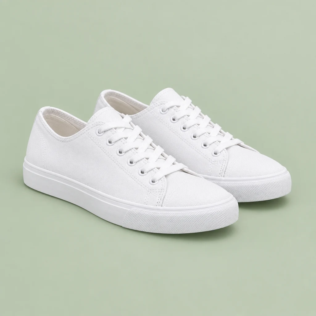
Flare, 1:1, 1K / Medium, 10 credits, 23 seconds. First output.
What to check: the details you can count or read. Here that means one pair, no logo on the tongue or heel, white laces, a visible toe-cap stitch line, and nothing else in the frame. All five held.
Why this prompt works: it describes the product like a spec sheet (materials, colors, what is absent) and the photo like a shot list (angle, background, light direction, shadow). The last sentence closes the door on everything else.
Task 2: Preview changes in a room photo
The goal: preview a wall color and a new plant while keeping the rest of a room image stable. We used an AI-generated starting image so we could publish both files. A real phone photo may contain more complex lighting, reflections, people, or clutter, so test preservation carefully on your own image.
We asked for two changes in one edit.
View the prompt for the starting photo
A realistic smartphone photo of a small, lived-in living room in daylight: a light gray three-seat fabric sofa against a plain white wall, a round oak coffee table with one ceramic mug on it, a striped wool rug on a light wood floor, and a tall window on the left letting in soft afternoon light. Slightly off-center framing, natural colors, a little everyday clutter, eye-level view from the doorway. No people, no text, no watermark.
Flare, 4:3 preset, 1K / Medium, 10 credits, 22 seconds.
The edit prompt:
Repaint only the wall behind the sofa in a warm terracotta color with a matte finish. Add one tall potted fiddle-leaf fig plant, about as tall as the window, standing on the floor between the sofa and the window. Keep the sofa, cushions, coffee table, mug, rug, floor, window, lamp, bookshelf, lighting, camera angle, and framing exactly as they are. Do not add or remove anything else.
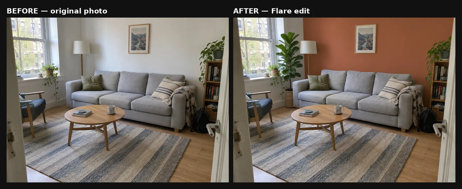
Left: the starting image. Right: Flare edit, 10 credits, 24 seconds. Aspect ratio was left on Auto-detect, and the output retained approximately the same landscape shape at 1184 × 880.
What held: on visual inspection, only the wall behind the sofa changed color. The window wall on the left stayed white. The plant landed where we asked, between the sofa and the window. The sofa, cushions, throw, coffee table, mug, rug, lamp, bookshelf, armchair, and even the backpack on the floor remained in place.
How to write edits like this:
Say where the change stops. “Only the wall behind the sofa” is what kept the second wall white.
Place new objects against things already in the photo. “Between the sofa and the window” and “about as tall as the window” give the model a position and a size it can measure.
List what must stay. The model cannot tell which details you care about unless you name them.
Task 3: Combine two images into one
The goal: place the sneakers from Task 1 into a lifestyle scene while preserving their defining product details.
In Edit image mode, upload both images. Then refer to them by number in the prompt, in the order you uploaded them.
View the prompt for the café step scene
A realistic photo of a sunlit concrete step outside a cafe entrance, with a terracotta pot of lavender on the left and warm morning light casting long soft shadows. Eye-level view, shallow depth of field, clear empty space in the center of the step. No people, no shoes, no text, no watermark.
Flare, 1:1, 1K / Medium, 10 credits, 22 seconds.
The combining prompt:
Image 1 is a product photo of white canvas sneakers. Image 2 is a sunlit cafe step. Place the pair of sneakers from image 1 in the center of the step in image 2, at the same three-quarter angle, scaled naturally to the step. Match the warm morning light of image 2 and cast soft shadows in the same direction as the existing shadows. Keep the sneakers exactly as they are in image 1: white canvas, white laces, white soles, no logos. Keep the step, the lavender pot, the doorway, and the background from image 2 unchanged. No text, no watermark.
We ran this one three times with each model, because combining images is where differences between them are most likely to show.
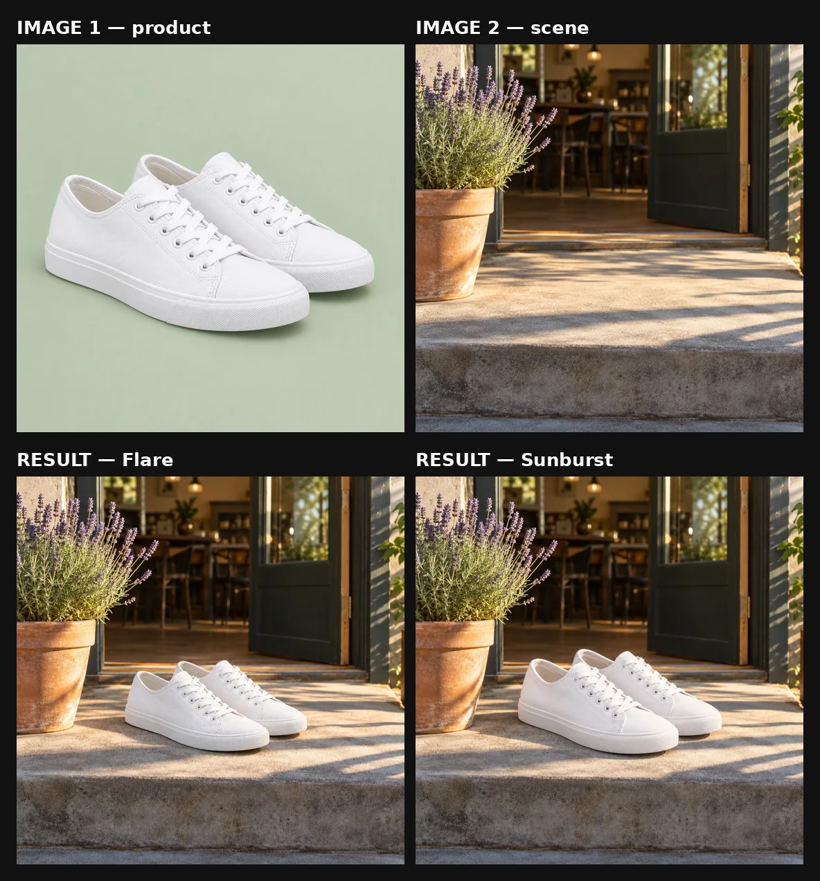
Top: the two uploaded references. Bottom: the first run from Flare (32 s) and Sunburst (43 s), 10 credits each.
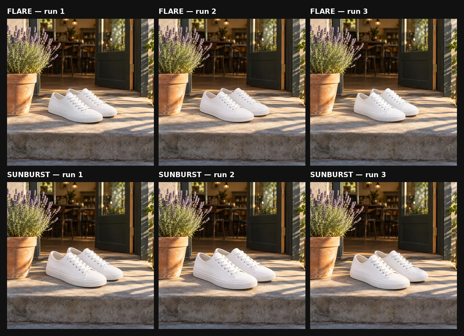
All six runs with the same references and prompt. Flare: 32, 42, and 47 seconds. Sunburst: 43, 37, and 39 seconds.
All six runs got the job done. In every output, the shoes sit on the step at the requested angle. The lavender pot, doorway, and visible café structure remained recognizably consistent, and the new shadows followed the scene’s existing direction.
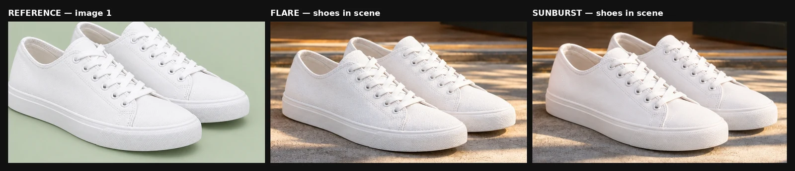
Close-up of the shoes in the reference and in each model’s first run. Both kept the low-top shape, white laces, eyelet rows, toe-cap stitching, and plain white soles, as did the other four runs.
One difference repeated across all three pairs: size. Sunburst placed the shoes noticeably larger on the step than Flare in every run. Three runs per model on one scene is still a small sample: verify on your own assets rather than treating this as a general model rule.
The result is a newly generated composite rather than a pixel-for-pixel product cutout. Check logos, proportions, stitching, colors, and other catalog-critical details before commercial use.
The fix for the size difference is in the prompt. “Scaled naturally” left the size to each model, and they chose differently every time. Give a measurement instead, such as “the pair together should span about one third of the step’s width.”
Task 4: Turn one brief into three social formats
The goal: one campaign image for a feed post, a story, and a website banner.
We used the same prompt three times and changed only the aspect ratio:
An appetizing photo of a tall glass of iced coffee with milk swirling into it, ice cubes, and a paper straw, on a sunlit marble cafe counter with soft green plants blurred in the background. Leave clean empty space for a headline. Bright, fresh, natural light. No text, no logos, no watermark.
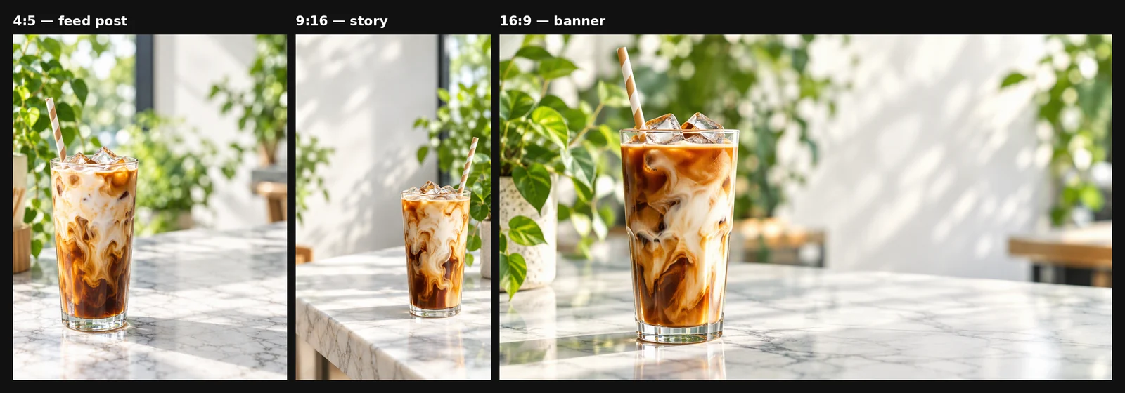
Flare, 1K / Medium, 10 credits each. 4:5 took 30 s, 9:16 took 25 s, 16:9 took 34 s.
The model recomposed the shot for each shape instead of cropping it. In 4:5 the glass sits on the left with space on the right. In the tall 9:16 story it moves down and shrinks, leaving the top of the frame free for a headline. In the wide 16:9 banner it moves to the left third with the right half open. In all three, “leave clean empty space for a headline” was respected, in a place that suits the format.
The practical lesson: for flexible campaign visuals, generate each format directly rather than cropping one square image. A cropped square either cuts the subject or loses the empty space you need for text.
XMK returned 912 × 1152, 768 × 1360, and 1360 × 768 pixels for the three selected aspect-ratio presets at 1K.
One caution: separate generations can also change product details. Across the three images, the glass shape, the ice, the straw angle, and the background plants all differ slightly. If visual identity must remain consistent across formats, select one approved image first, upload it as the identity reference, and ask GPT Image 2.5 to recompose it for each aspect ratio.
Task 5: Add exact text to a social post
The goal: a bakery promotion with a headline and opening hours, spelled correctly and laid out as requested.
In an earlier poster test, a long headline wrapped onto extra lines. The fix is to tell the model how many lines you want, which line is biggest, and that the headline must stay on one line:
Design a 4:5 social media post for a neighborhood bakery. A warm overhead photo of a rustic sourdough loaf and three croissants on a floured wooden board fills the lower two-thirds. In the upper third, on a clean cream band, render exactly two lines of text and no other words: line 1 “FRESH BREAD DAILY” in bold dark brown capitals, the largest text in the image, on one unbroken line; line 2 “Open 7 AM - 3 PM” in smaller dark brown type below it. Spell both lines exactly. No logos, no watermark.
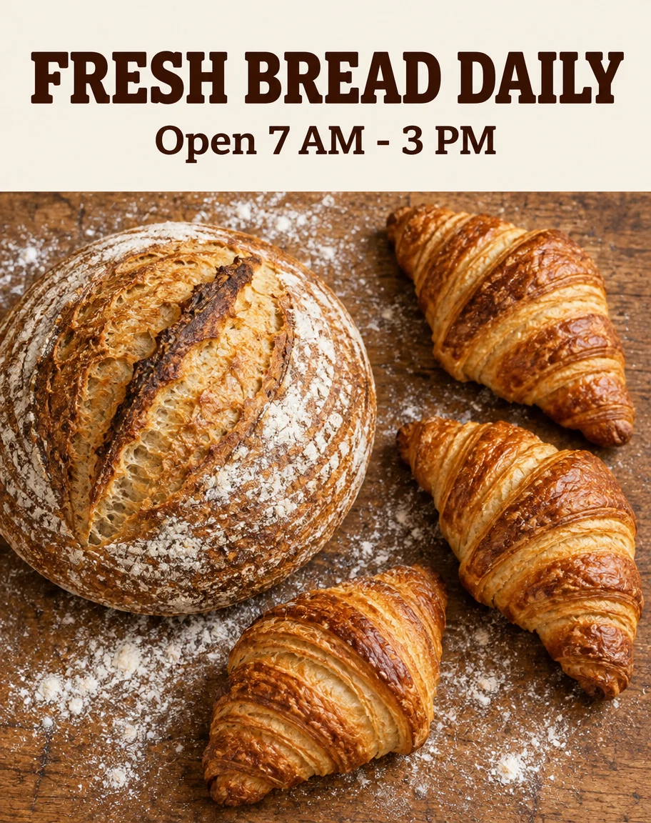
Run 1: Flare, 4:5, 1K / Medium, 10 credits, 21 seconds.
We ran the same prompt three times to see how repeatable the result was.
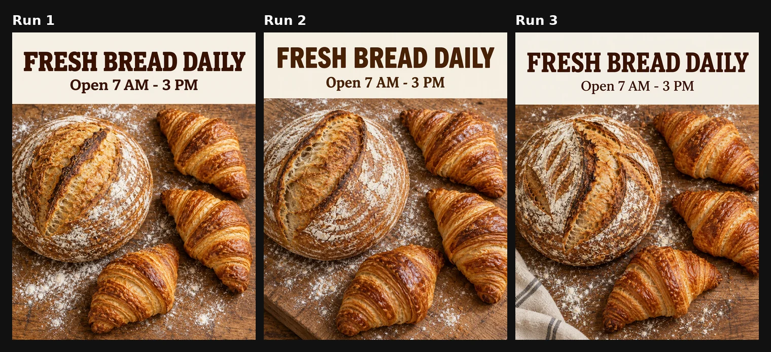
Runs 1–3: 21, 34, and 26 seconds, 10 credits each.
Check | Run 1 | Run 2 | Run 3 |
|---|---|---|---|
“FRESH BREAD DAILY” spelled exactly | ✓ | ✓ | ✓ |
“Open 7 AM - 3 PM” spelled exactly | ✓ | ✓ | ✓ |
Headline on one line, largest text | ✓ | ✓ | ✓ |
No extra words | ✓ | ✓ | ✓ |
Exactly three croissants | ✓ | ✓ | ✓ |
No unrequested objects | ✓ | ✓ | ✗ striped tea towel |
All three runs got the text right. Three out of three does not guarantee perfect lettering in every generation, but it shows the prompt structure is doing real work: it leaves the model few layout and wording decisions to make. The one miss was not in the text at all: run 3 added a striped tea towel, because the prompt excluded logos and watermarks but never said “no other objects”.
How to write text prompts:
Put every word you want in quotes, and add “no other words”.
Number the lines and say which is largest.
For long headlines, say “on one unbroken line” so the model resizes the type instead of wrapping it.
Tell the model where the text goes (“upper third, on a clean cream band”), so it plans the layout around it.
What surprised us, and how to avoid it
None of the five tasks failed outright, but we found four things we would write differently next time. Each one points to a habit worth building.
What happened | Why | What to write instead |
|---|---|---|
The “lived-in” room photo came back with an armchair, a bookshelf, plants, a lamp, and a backpack we never asked for | “A little everyday clutter” invites the model to invent objects | List the objects you want and add “no other objects” |
Flare and Sunburst put the sneakers on the step at different sizes, in all three pairs | “Scaled naturally” leaves size to the model | Give a size relative to something in the scene |
One of three bakery posts added a tea towel | The prompt ruled out logos and watermarks, not extra objects | Add “no other objects” to every prompt with a fixed inventory |
The combining prompt asked the shoes to both match the scene’s light and stay exactly as in the reference | These two goals pull against each other | Decide which matters more and say so |
Flare or Sunburst?
Start with Flare for drafts and routine edits. Test Sunburst when fine material detail or editing precision matters. Model choice is only one variable: reference quality, prompt boundaries, resolution, and quality settings can change the result. This guide’s own evidence is limited to Task 3: there, Sunburst was slightly quicker (39 s median against Flare’s 42 s) and placed the shoes larger in every run, while both kept the product details. See our controlled Flare vs Sunburst test for the full comparison.
Frequently asked questions
How much does GPT Image 2.5 cost on XMK?
A 1K / Medium image costs 10 credits with either model, which is what every example in this guide used. Higher resolutions and quality levels cost more; the exact price appears next to the Generate button before you generate. See the full credit table.
How long does GPT Image 2.5 take?
In our tests at 1K / Medium, new images took 21 to 34 seconds and edits took 24 to 47 seconds, including queueing.
Can I combine several images in one generation?
Yes. In Edit image mode you can upload up to 16 references. Refer to them as “image 1”, “image 2” and so on, in the order you uploaded them, and say what to take from each.
Should I crop one image for different platforms?
For flexible campaign visuals, generating each format directly usually produces a better composition than cropping one square image. In Task 4 the model recomposed the shot for 4:5, 9:16, and 16:9, keeping the subject and the headline space in sensible places for each. If product identity must remain exact, use one approved image as a reference when creating the additional formats.
How can I improve text accuracy?
Quote every word, number the lines, say which is largest, and ask for long headlines “on one unbroken line”. In our test the prompt in Task 5 got the text right in three runs out of three. That is not a guarantee, but it removes most of the layout guesswork.
Try GPT Image 2.5 on XMK
For your first run, choose one task from this guide and copy its structure rather than its subject. Start at 1K / Medium, review the output against three to five measurable requirements, and change one variable in the next generation.